Netflix is rolling out its first major television app redesign in a decade to enhance user experience and boost viewing time. This redesign aims to combat subscriber churn and make content discovery simpler, reducing decision fatigue for users.
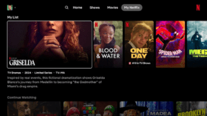
Key changes include enlarged title cards, reorganized information, and easily digestible insights like a show’s “top 10” performance. These updates address the “eye gymnastics” issue where users rapidly scan the screen before choosing content. Additionally, the menu button is now at the top of the screen, and a new “My Netflix” tab consolidates the user’s watchlist and in-progress content.
This redesign aligns with Netflix’s shift from focusing on subscriber growth to engagement metrics. Starting next year, Netflix will highlight viewing time as the main measure of customer satisfaction instead of subscriber numbers. Currently, the redesigned interface is being tested with a select group of users, with plans for a wider rollout based on feedback.
Shares of Netflix, which have risen 38% this year, experienced a slight dip, down about 0.5% to $647.49 in afternoon trading on Nasdaq.